How-to guides
Short, visual walkthroughs of the most common tasks. Start typing to search — matching guides jump to the top with the matched words highlighted; click a guide to center it and read.
Map basics
Change the basemap (satellite view)
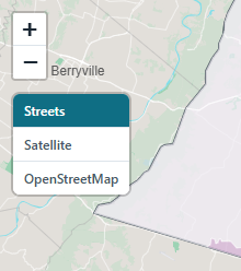
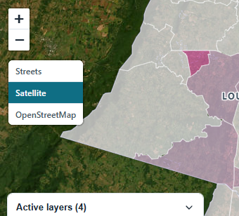
- Find the basemap switcher in the top-left corner of the map, just below the zoom buttons.
- Click Satellite for aerial imagery, OpenStreetMap for a general-purpose street map, or Streets to return to the atlas's built-in map.
- Your choice is remembered for the next visit. Streets works offline; the other two stream from the internet.
Switch between Basic and Advanced mode
- Use the Basic / Advanced toggle in the top bar.
- Basic keeps six core layers with plain-language names. Advanced unlocks every dataset, variable switcher, filter, and the report builder.
Turn on dark mode
- Click the moon icon in the top bar. Click the sun to switch back.
- The basemap, panels, and charts all follow the theme.
Layers
Turn layers on and off
- Open the Layers panel (on smaller screens, tap the Layers button; on desktop it is the right-hand panel).
- Layers are grouped by topic — Flooding, Extreme heat, Severe weather, People & vulnerability, Context. Click a group header to expand it.
- Tick a checkbox to add the layer to the map; untick to remove it.
Show or hide place-name labels
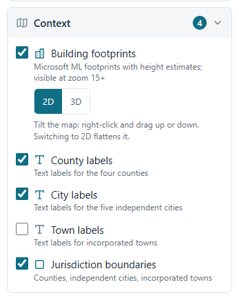
- Expand the Context group at the bottom of the layer list.
- County, city, and town labels are separate layers — tick exactly the ones you want.
Change a layer's colors, line width, or opacity
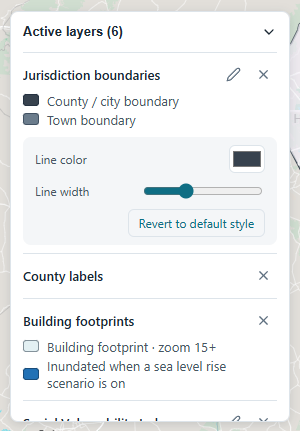
- Find the layer in the Active layers widget in the bottom-left corner of the map.
- Hover the layer's row (on a phone the buttons are always visible) and click the pencil.
- Adjust color, width, and opacity — the map updates live. Revert to default style undoes everything.
On a phone, the pencil opens a full-width editing sheet above the map so the color picker has room.
See what's on the map, and remove layers quickly
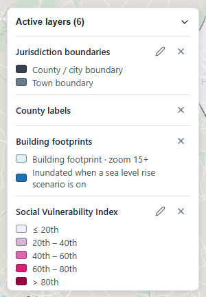
- The Active layers widget in the bottom-left corner lists every layer currently on the map, with its legend.
- Click the × on a row to remove that layer. Click the widget's header to collapse it out of the way.
Pick a scenario, time period, or filter
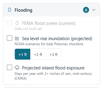
- When a layer offers choices, they appear right under its checkbox.
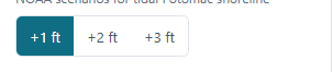
- Sea level rise has +1 / +2 / +3 ft buttons; projected heat has time periods; storm events have type and decade filters; SVI and demographics have variable dropdowns (Advanced).
Buildings in 3D
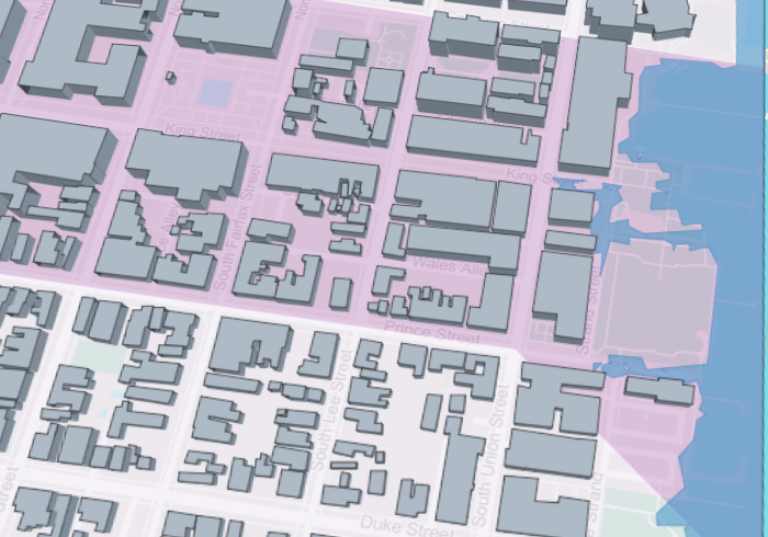
View buildings in 3D and tilt the camera
- Building footprints are on by default (Context group) and appear once you zoom to level 15 or closer.
- Under the Building footprints checkbox, switch the 2D / 3D toggle to 3D.
- Buildings extrude to their estimated heights.
- To tilt the whole map into perspective, right-click and drag up or down (on a phone, drag up or down with two fingers — pinching still zooms). The basemap, flood zones, and every other layer tilt together, and buildings stand up out of the tilted ground.
- Drag back down to flatten, or switch to 2D — that always resets the view to straight down.
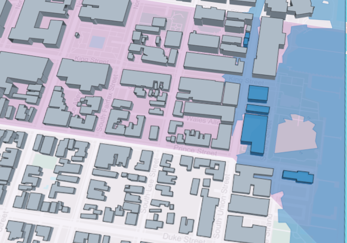
See which buildings a flood scenario reaches
- Turn on Sea level rise inundation (Flooding group) and pick a scenario.
- With Building footprints on, buildings standing in the inundated area turn blue — and in 3D, a water line is drawn on their walls at the scenario depth.
- Click a highlighted building to confirm: its details say which scenario reaches it.
Reading the data
Get details and charts for any spot
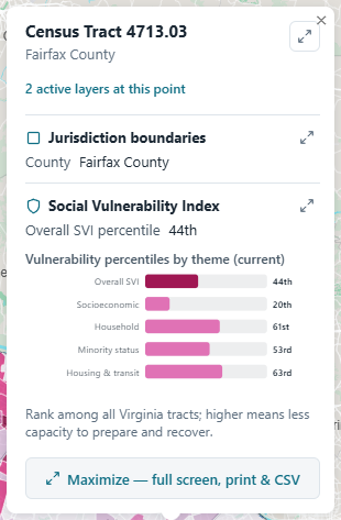
- Click anywhere on the map. A window lists every active layer at that point — one section each, with charts for historical, current, and projected values where the data supports it.
- Hovering a feature previews its numbers in the top-right corner box without clicking.
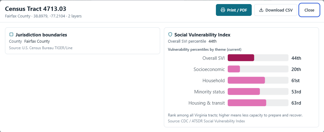
Expand details full screen, print them, or download CSV
- In the click popup, press any maximize button (top-right corner, next to a section title, or the bar at the bottom).
- The full-screen view has Print / PDF for a clean document and Download CSV for every number on display.
- On a phone, clicking the map opens this full-screen view directly.
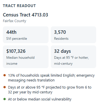
Read a neighborhood's combined report
- Click any census tract on the map.
- The Tract readout in the side panel combines vulnerability, population, income, projected heat, and plain-language flags for that neighborhood.
Reports & export
Create an advanced report
- Switch to Advanced mode (top bar).
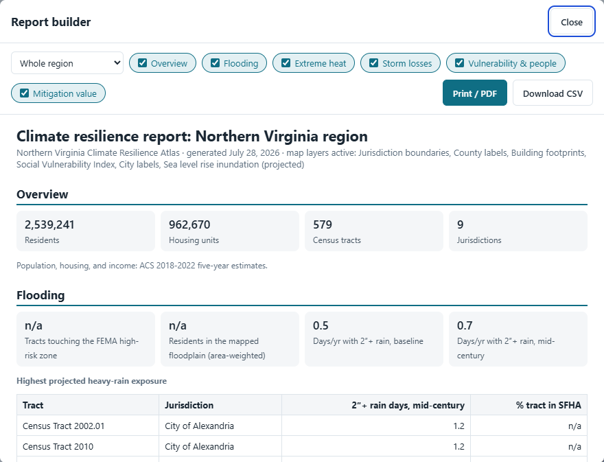
- In the side panel, click Build a report.
- Pick a scope — the whole region or one jurisdiction — and tick the sections you want. The preview updates live.
- Print / PDF makes a clean document; Download CSV exports the tract-level table behind it.
On your phone
Use the atlas on a phone
- The layer panel becomes a bottom sheet — open it with the Layers button, swipe the list inside it.
- Tapping the map opens the full-screen details view directly, with print and CSV built in.
- Styling a layer opens a full-width editing sheet, so the color picker and sliders are easy to hit.
User guide
Two ways to use the atlas
Basic keeps things simple: six core layers with icons, one tap to turn each on, and a plain-language report for any neighborhood you click. Advanced unlocks every dataset, variable switcher, time period, filter, and the report builder. Switch modes any time with the toggle in the top bar; the atlas remembers your choice.
Working with layers
- Layers live in collapsible groups (Flooding, Extreme heat, Severe weather, People, Context). Tap a group header to open or close it.
- Every active layer appears in the widget on the map with its legend. Hover a row for two controls: the pencil opens the style editor (colors, line width, opacity, point size, with a revert button); the x removes the layer.
- Text labels for counties, cities, and towns are layers too, under Context.
- The box in the top-right corner of the map mirrors whatever feature your pointer is over.
Reading a neighborhood
Click any census tract and the side panel returns its combined readout: social vulnerability percentile, population and income, flood-zone share, projected hot days, and plain-language flags an emergency manager would care about.
Building a report (Advanced)
Open the report builder from the side panel. Pick a scope (the whole region or one jurisdiction), tick the sections you need, and check the live preview. Print / PDF produces a clean document; Download CSV exports the tract-level table behind it for your own analysis.
Dark mode
The sun/moon button in the top bar switches themes; the basemap follows.
Frequently asked questions
- Where does the data come from?
- Federal public-domain sources (FEMA, NOAA, CDC/ATSDR, U.S. Census Bureau, USGS/MRLC) and the interagency CMRA projections, each snapshotted into the atlas's own files. The About page lists every source, its license, and its vintage.
- How current is it?
- Each layer's download date is recorded in a metadata sidecar. Storm records run 1950 through 2026; demographics are the 2018-2022 ACS; SVI is the 2022 release; climate projections cover baseline, mid-century, and late-century periods.
- Can I trust the analytics numbers?
- They are screening values built from cited public methods (FEMA benefit-cost policy, NIBS Mitigation Saves 2019, CPI-adjusted NOAA records). Use them to rank places and hazards, then commission a project-level analysis before committing funds. The methodology note states every assumption.
- What projection do the layers use?
- Web display uses WGS 84 (EPSG:4326) / Web Mercator, the standard for browser maps. Source data arriving in Virginia State Plane North (NAD 1983 HARN, US feet) is reprojected on ingest, and exports can be delivered back in State Plane for GIS use.
- Why does a layer say "coming soon" or "data not built yet"?
- The layer is registered but its data pipeline has not been run (or a source server is temporarily refusing requests). The toggle lights up as soon as the data lands.
- Does the map work on my phone?
- Yes. The panel becomes a bottom sheet, feature details open in the sheet instead of small popups, and controls meet touch-size guidelines.
- Who is this for?
- Planners deciding where growth should go, emergency managers pre-positioning for floods and heat, elected officials weighing mitigation spending, and residents checking their own exposure.
Data sources and downloads
- Full data catalog with licenses and credits
- Analytics methodology and assumptions
- Tract-level data: use the report builder's CSV export, or the GeoJSON endpoints under
/geo/.
- Economic model:
analytics/loss_model.xlsx in the project repository, with every assumption editable.
- Metadata: each data file ships with a JSON sidecar (source, date, record count, CRS); ISO 19115-3 XML starter records accompany them.
Basemap data © OpenStreetMap contributors.